My website looks bad on my phone—how do I fix that?
May 27, 2025
Posted By:
Hoopr.

My website looks bad on my phone—how do I fix that?

Your Site Looks Fine on Desktop—But a Mess on Mobile?

Join the club. It’s one of the most common complaints we hear from business owners:

“Why does my site look so weird on my phone?”

With over 60% of all web traffic now on mobile, this isn’t a side issue—it’s the main stage.

Let’s break down why your site might look off on phones and how to fix it fast.

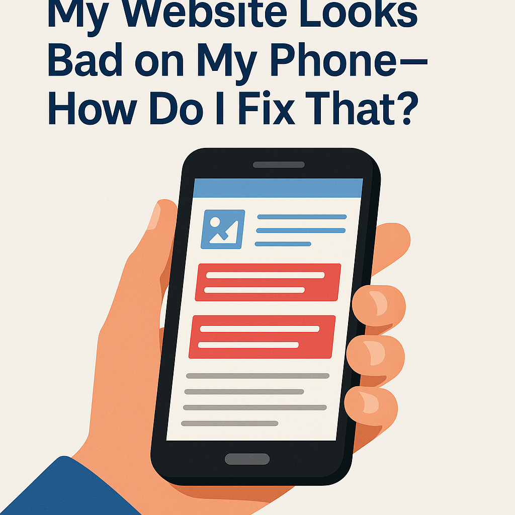
Common Reasons Your Site Looks Bad on Mobile

  1. It’s Not Responsive
    A responsive website automatically adjusts layout, text, and images based on screen size. If yours isn’t, mobile users get stuck zooming and scrolling sideways.
  2. Text Is Too Small or Hard to Tap
    Buttons too close together or tiny fonts = bad UX. Google even penalizes sites with poor mobile usability.
  3. Images and Layouts Break
    Fixed-width elements (like images or tables) don’t shrink on mobile, so they either overflow or break the layout.
  4. Slow Load Times on Mobile
    If your mobile site drags, users bounce. This often happens with bloated code, oversized images, or too many scripts.

How to Fix a Bad Mobile Experience

Use a Responsive Theme or Builder
If you're using WordPress, make sure your theme is mobile-friendly. Platforms like Squarespace, Webflow, and Shopify offer responsive designs by default.

Preview and Test
Use Chrome DevTools to preview your site on different screen sizes, or tools like BrowserStack to simulate mobile devices.

Simplify Navigation
Use hamburger menus, clean headers, and easy-to-tap buttons.

Resize and Optimize Images
Make sure images scale correctly and load fast on mobile networks.

Avoid Popups or Overlays That Cover Content
Intrusive popups kill mobile UX—and often get flagged by Google.

Mobile Isn’t Optional—It’s Priority #1

If your site doesn’t work well on phones, you’re losing visitors and sales. Fixing your mobile experience is one of the fastest ways to improve bounce rate, time on site, and conversion.

Ready to Make Your Website Mobile-First?

At Hoopr Media, we design and optimize websites that look great everywhere. We’ll make sure your mobile visitors get the full experience—not the frustration.

Let’s get your site mobile-ready—reach out today.